
Mobile first index, from Google indications to prepare for the switch

Since July 1 2019, practically a year ago, mobile first indexing has become the default system with which Google discovers and indexes new sites, as well as the one enabled for most sites currently scanned. This is not surprising, given the effort that the Mountain View team has dedicated to this topic, but the work is not yet finished and there are still many sites that are not ready for this switch: it is to them that is dedicated the latest article of the official blog of the company, that offers tips and hints to better prepare sites for mobile first indexing for everyone.
Default mobile first indexing for everyone by March 2021
The post, signed by Yingxi Wu (and from which all the images on the page are taken), starts with the news of the postponement of this final step to the indexing system via Googlebot smartphone: in spite of the initial plan – to enable the mobile-first indexing for all sites of the Search system already by September 2020 – the new “deadline” is the end of March 2021 (returning in practice to the date already announced on other occasions).
This decision was affected by the pandemic effect because, as we read in the article, “we realized that in this uncertain situation it is not always easy to focus on work as before, so we decided to extend the time” to prepare for the switch.
Main issues with the mobile first indexing
The slip has also become necessary because Google has noted that there are still many sites that are not yet ready for mobile-first indexing; in addition to the indications on the main errors that can block these sites (very frequent offers, as also seen in our articles), the work “on the field” has allowed to perform new tests and evaluations that have brought out other types of problems with this type of scanning and indexing “that is worth mentioning” to have really ready sites.
The crux of the matter is simple: in mobile first indexing, Google only gets the information from the mobile version of a site, so it is essential to make sure that Googlebot can see the entire content and all the resources in this version, paying particular attention to certain elements.
Meta tag robots in the mobile version
The first advice of Yingxi Wu is to use in the mobile version the same meta tag robots as those provided on the desktop version. If we use a different one on the mobile version (like noindex or nofollow), Google may not be able to index or follow the links on the page when the site is enabled for mobile-first indexing.
Lazy-loading on the mobile version
The lazy-loading system is more used on mobile devices than on desktop ones, especially for the uploading images and videos: the Googler recommends to refer to the best practices (also for image optimization), and in particular to automatically load the content based on its visibility in the viewport and, above all, to avoid lazy loading of primary contents based on user interactions (such as scrolling, clicking or typing), because Googlebot will not activate them.

An example helps us to better understand this aspect: if a page has 10 primary images on the desktop version and the mobile version has only 2, with the other 8 images uploaded by the server only when the user clicks on the “+” button, Googlebot will not click on the button to load these additional 8 images, and then Google will not see those images. The result is that those resources will not be indexed or shown in Google Images.
Awareness of what we block
Some resources have different Urls on the mobile version compared to those on the desktop version, sometimes even offered on different hosts: if we want Google to scan these Urls, we must verify that we have not blocked them with a disallow in the robots.txt file.
An example is also supported here: the blocking of URLs of .css files will prevent Googlebot from properly viewing our pages, resulting in the risk of damaging their placement in the Search (we were just talking about it yesterday!). Similarly, blocking image Urls will make them disappear from Google Images.
Providing the same primary content on mobile and desktop
In principle, then, what matters is to make sure that on desktop and mobile devices there is the same main content, namely “the content you want to place yourself with or why users arrive on your site”.
With the new (and not even new, now…) system, Google uses for indexing and ranking in Search only the contents shown in the mobile version. Therefore, if our mobile version has less content than the desktop version, you may need to update and rebalance this situation, or else our site will risk losing some traffic when enabling mobile first indexing, because Google will no longer be able to get the complete information.
Using the same titles and headings
This general advice also applies to the more practical aspects.
The first element mentioned in the article is to use the same clear and meaningful headings both on the mobile version and on the desktop version: the absence of meaningful titles (the adjective is also repeated by Google) can negatively affect the visibility of our page on the search engine, because Google may not be able to fully understand the page.
For example, if the desktop page has the following tag for the page header:
<h1>Pictures of cute puppies on the blanket</h1>
also the mobile version should use the same tag with the same words, instead of having titles like:
<h1>Picture</h1> (unclear and not significant)
<div>Pictures of cute puppies on the blanket</div> (not using a header tag)
Checking images and videos
Images and videos have an increasingly decisive role to offer users a positive and immersive experience: for this reason, Yingxi Wu recommends to check some specific aspects to optimize our site and to respect some best practices on images.
Image quality
Do not use too small or low-resolution images in the mobile version, because they may not be selected for the inclusion in Google Images or positively shown when indexed.

For example, if our page has 10 primary images on the desktop version, normal and of good quality, it is a bad practice to use very small thumbnails in the mobile version to adapt them all to the smaller screen size. Such miniatures could be considered “low quality” by Google because they are too small and with a low resolution.
Alt attributes for images
Even the use of less significant alt attributes could negatively affect the display of images in Google Images.
A good practice is as follows:
<img src=”dogs.jpg” alt=”A picture of a cute puppy on the blanket”> (meaningful alt text)
while the following formulations are not recommended:
<img src=”dogs.jpg” alt> (missing alt text)
<img src=”dogs.jpg” alt=”Picture”> (not significant alt text)
Managing different image URLs between desktop and mobile version
If our site uses different image Urls for desktop and mobile version, we may experience a temporary loss of traffic from Google Images as the site switches to mobile-first indexing. The reason is that image Urls in the mobile version are new in Google’s indexing system and it takes some time before they are properly understood.
To minimize this temporary loss of traffic, we can verify the ability to retain image Urls used by the desktop.
Video markups
If for the desktop version we use Videoobject structured data to describe videos, it is important that the mobile version also includes the Videoobject, providing equivalent information. Otherwise, Google’s video indexing systems may find it difficult to get enough information, so our videos will not be visible in the Search.
Placement of videos and images
The mobile page structure is also a crucial node, and the Googler suggests that you place videos and images in an easy-to-find location. Otherwise, you may be negatively impacting on the user’s experience, and Google may not prominently display our media resources in searches.

For instance, if we have a video embedded in the content in an easy to find location on the desktop, we must be careful to replicate this structure in the mobile version as well.
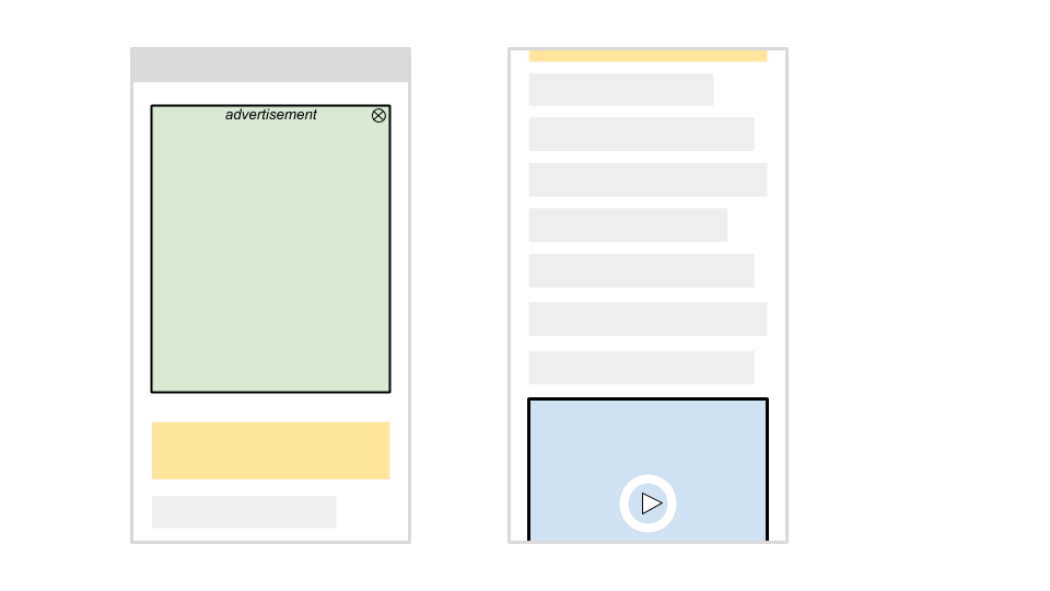
Placing an ad at the top of the page, which occupies much of the same, could result in the displacement of the video off the page and require users to scroll down a lot to find the video. In this case, the page might not be considered a useful landing page for videos by Google’s algorithms, and the video will not be shown in the search.
The evolution of Google’s mobile first indexing
Mobile-first indexing has come a long way, writes Yingxi Wu, and it’s “nice to see how the Web has evolved from desktop to mobile device” and also how “webmasters have helped to allow scanning and indexing to meet the way users really interact with the Web”.

