A guide to heatmaps, also useful to SEO

They are called heatmaps, and they are a quick and effective tool for understanding what users do on the pages of a Web site: where they click, how far they scroll, what they look at or ignore. Compared to other analytical tools, heatmaps can provide a more complete overview of how users actually behave and the areas where they interact best, thus allowing us to get a picture of the strengths of the page and, more importantly, the critical points where we can intervene with appropriate corrections. This is precisely why they are also a valuable support for SEO strategy and allow us to find out what types of content and images best capture the attention of the audience and where people have difficulty navigating.
What heatmaps are
Sometimes also called heat maps, heatmaps are a visual representation of the browsing data of a web page, which through a color scale immediately show how users interact with that page, where they click and where they do not click, how far they have scrolled down a page, or what the results of eye-tracking tests are.
More specifically, the key feature of a heatmap is to provide in graphical form, through a color scale, key information to visualize the amount and distribution of certain variables within a dataset. In this sense, the heatmap is precisely a graphical representation of data in which values are represented by colors: typically, user behavior is measured on a scale from red to blue, with the hottest color indicating the highest level of engagement and the coldest indicating areas with the lowest levels of engagement. To simplify, then, warmer colors, such as red and orange, indicate areas of higher activity or interaction, while cooler colors, such as blue and green, indicate areas of lower activity.
Heatmaps are thus a tool for graphically visualizing the actions users take within web pages, making it easier to visualize complex data and understand it at a glance.The basic idea is to allow those who own or manage a site to understand the performance of a specific page and to quickly approach information from complex datasets through the representation of values using color.
What heatmaps are used for
Heatmaps are used in various forms of analytics, but they are most commonly used to show user behavior on Web pages or specific Web page templates, because thanks to color coding, they allow users to immediately understand which parts of that page receive the most attention, and thus provide information and insights on how to improve site structure or the placement of certain content and resources, such as clickable elements or the menu.
Indeed, heatmaps can become essential for detecting what works or does not work on a site or on a specific product page and for intervening in optimizing web usability-the ease of use and thus of understanding and navigating the site and its pages-which in turn can enable increased conversions. In practical terms, by leveraging techniques such as A/B testing to experiment with the placement of certain buttons and elements on the site, heat maps allow us to assess actual page performance and understand which parts of our website attract users’ attention the most (where they click, how much they scroll, where they linger the most), with the goal of using this information to increase user engagement and retention , improving their experience of interacting with the site.
For example, if we notice that users spend a lot of time on a particular section of our site, we might decide to place the most relevant content or call-to-actions there. Or, conversely, if we notice that a particular area of our site is being ignored, we might decide to revise the layout or design of that section.
How heatmaps work
There are a number of tools for understanding what impact our content and its organization has on users, and for example Google Analytics is a treasure trove of data for understanding how people arrive at our site, how many and which pages they visit, and from which page they leave the navigation, but they do not allow us to go into detail about the actual interaction.
Instead, the concept on which the application of heatmaps to the Web is based is as follows: scrolls, movements and mouse clicks are analyzed and, through specific software, transformed into concentrations of color that allow us to see the density of use of the various sections of a page.
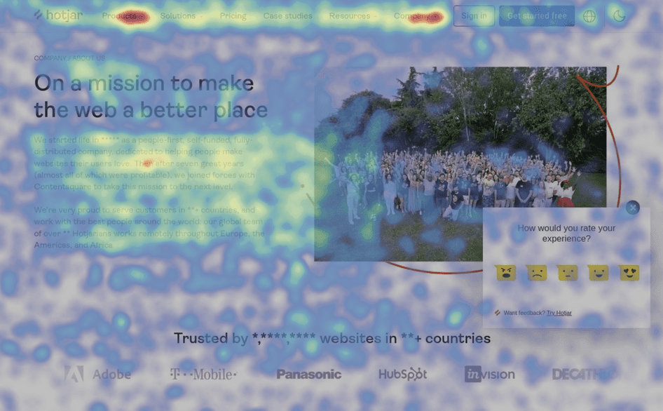
The areas with which the user interacts the most are those marked with warm colors, such as red and orange, while green and blue (or at any rate generally cool colors) identify the areas with the least interactions: so it really only takes a glance to understand and see which parts of a page receive the most attention and thus draw indications on how to improve the structure or visibility of the page.
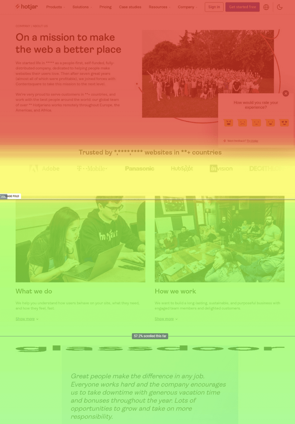
By aggregating user behavior, heat maps facilitate data analysis, combining quantitative and qualitative data, and provide a snapshot of how the target audience interacts with a single site or product page, what they click, scroll or ignore, on the average “fold” portion (the part of the page that people see on the screen without scrolling as soon as they land there).
In this way, heat maps provide marketers, digital and data analysts, UX designers, social media specialists, and anyone working in digital marketing with in-depth information about people’s behavior on their site, helping them identify trends, find out what page limitations are blocking conversions, and, as a result, what actions they can take to increase engagement and sales.
The history of heatmaps: not just computing
Although a very current tool, the practice of using heatmaps originated in the 19th century, specifically in manual grayscale shading from a data matrix, with very useful applications especially in the medical field.
For example, in the mid-19th century British physician John Snow used a map to visualize the spread of a cholera epidemic in London. Snow colored areas of the map according to the number of cholera cases, creating a kind of primitive heatmap that allowed him to identify the source of the epidemic and take the necessary measures to contain it. A few more years, in 1873, French statistician Toussaint Loua made the first example of a heat map, creating a shading matrix system to display social statistics in the districts of Paris, representing larger values with small gray or black squares and smaller values with lighter squares.

Later, other scholars showed the results of cluster analysis by permuting the rows and columns of a matrix to place similar values near each other based on clustering, while in the 1970s Robert Ling had the insight to join cluster trees to the rows and columns of the data matrix, using overloaded printer fonts to represent different shades of gray, one font width per pixel.
However, the use of heatmaps as we know them today began in the 1990s, with the advent of bioinformatics: researchers began to use heatmaps to visualize the results of gene expression experiments, in which the quantities of thousands of genes under different experimental conditions were measured, transforming complex data into an easily interpretable format to go to the discovery of patterns and correlations.
At this stage we recall two important moments for this tool: in 1994 Leland Wilkinson developed SYSTAT, the first computer program capable of producing cluster heat maps with high-resolution color graphics, and around the same time Cormac Kinney (a software designer) trademarked the name “heat map” to describe a 2D display depicting financial market information, useful for giving stock traders a visual tool to facilitate reading financial data in real time.
For the record, in 2003 the company that acquired Kinney’s invention unwittingly let the trademark expire.
With the advent of the Web, heatmaps have found a new application: the analysis of online user behavior. In 2005, web analytics company Crazy Egg introduced the first website heatmap service, which allowed site owners to visualize the areas of their site that attracted the most user attention, providing valuable information to optimize user experience and improve site effectiveness.
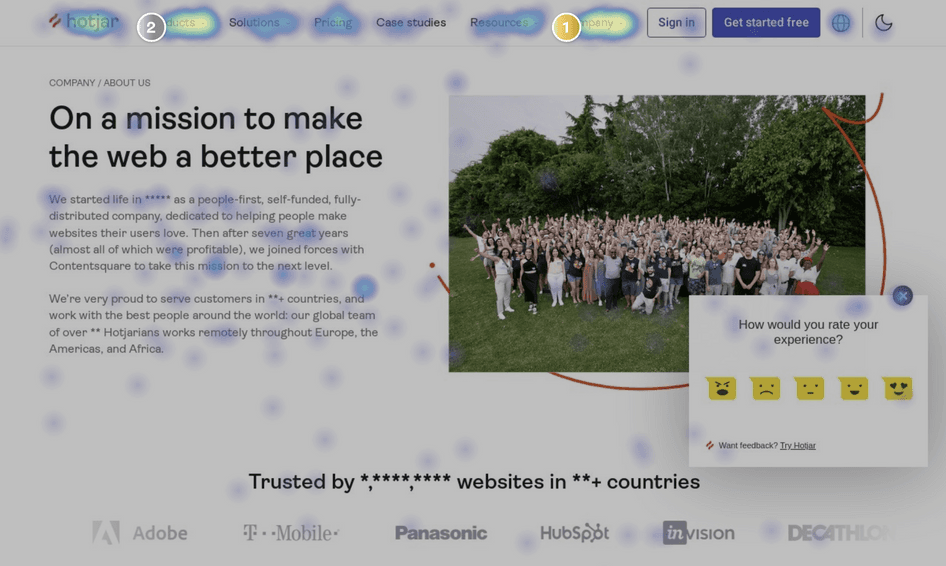
Today, heat maps can be created by hand, using Excel spreadsheets, or more simply through analysis tools such as Hotjar, probably the most popular tool for this purpose (da cui abbiamo tratto la maggior parte delle immagini in pagina).
What the types of heatmaps are
There are different types of heat maps, which essentially allow us to graphically display information about a specific parameter of user interaction. Depending on the type of analysis, working with such maps allows us to receive various information about user behavior and the type of content that attracts and retains the target audience and to better understand the interests and needs of our target audience.
So here is an overview of the main types of heatmaps used in Web analysis.
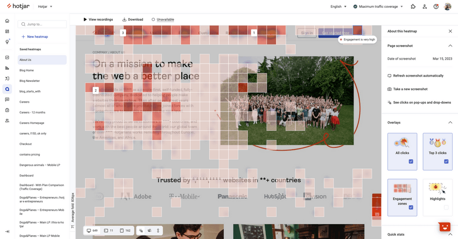
- Click Heatmaps or click heat maps are precisely maps that track clicks and chromatically identify the areas of the page where users most frequently click or tap from mobile. They analyze all interactive user actions on elements, such as internal links, navigation bar, logos, images, CTA buttons, and anything else that appears to be clickable. These heatmaps show an aggregate of where visitors click on desktop devices or tap on mobile devices (and are therefore also called touch heatmaps), coding with warm colors (red, orange, yellow) the elements that have been clicked and tapped on the most and with cooler colors the points that have fewer clicks. These maps can help us understand which elements of our site attract users’ attention and which ones are ignored.
- Scroll Heatmaps, or scroll heat maps, are maps that track scrolling and show how far users scroll down a web page, monitoring how deeply people scroll down the page and showing the portions of the page where readers get to before quitting browsing. Visually, the redder the area, the more people read it, while if there is a prevalence of blue and cool tones, it is worth considering appropriate corrections. In fact, these indications can help us to understand whether our content is too long or too short and whether users are able to easily find the information they are looking for; they can also help us to optimally position the most important content or call-to-actions.
- Move Heatmaps, are displacement maps that track users’ mouse movement on a web page, showing the areas where people move the cursor within the page. They can be used to understand how people perceive content and what attracts them most, but also to uncover elements that distract them from the main focus of the page. They provide controversial and not fully reliable information: it is true that users often move their mouse near the areas they are focusing their attention on, but this is not true in all cases. Thus, we cannot always directly correlate a visitor’s mouse movements to visual attention or what they are actually looking at: just because a user’s mouse has been on the headline for 5 minutes does not mean the person is still reading the headline, and more generally, users do not always look at the exact spot where their mouse is.
- Device Heatmaps, are specific heat maps for desktop and mobile devices and are used to show compare user interactions broken down by device type. For example, content that is prominent on a desktop page might be much lower on a phone, and so it is crucial to see if the interaction and user experience is different across devices and work to optimize our site for all types of users.

- Engagement Zones, are tools that combine interaction data sets derived from click, scroll, and move heat maps into one simple visualization. It is a powerful data visualization tool that divides a web page into sections or “zones,” showing the level of user interaction with each zone in a way that helps us analyze pages in seconds through a comprehensive view of user engagement with our product. In particular, they can help us understand which parts of our website are most engaging for users and which are being ignored. For example, engagement zones might highlight the presence of images on the page that do not receive clicks, but are liked by users, who look at them for a long time; or we might find that users interact a lot with our navigation bar, but ignore the footer. This information can guide us in optimizing site layout and design, allowing us to focus our efforts on the areas that have the greatest impact on user experience.
- Rage Click maps, are a type of heatmap that displays the areas of a Web site that users repeatedly click on in rapid succession, a behavior often associated with frustration or confusion. These maps can help us identify areas of our site that cause problems for users and need improvement. For example, we may find that users repeatedly click on a button that does not work properly, or on a link that does not take them to the intended page. This information can guide us in identifying and resolving usability issues, improving the user experience and reducing user frustration, so we can increase the chances of increasing conversions.

- Eye-Tracking Heat Maps, are maps that show where users look on a web page. These maps are generated using eye-tracking technologies, which detect and track the movement of users’ eyes when on the site, also indicating the duration of the viewing, and their creation is entrusted to laboratories that usually use webcams installed on devices (or special gaze-tracking tools made available to users chosen as “testers”). It is thus an advanced visualization that provides more detailed information about user behavior and experience, and thus requires specialized equipment that is often expensive to implement. Its information is valuable: if analytics reveal, for example, that people tend to give more relevance to the left side of the site, that is where it will be appropriate to place a logo, banner, and other important information.

The benefits of heatmaps and the information they show
Heatmaps are an extremely powerful data visualization tool because they allow us to transform complex data into easily interpretable information: in essence, they allow us to “see” the data, making it easier to discover patterns and correlations that might be difficult to identify in other formats.
However, it is important to remember that a heat map does not provide us with an explanation of why users behave a certain way: it only shows what users do on our site, not why they do it. To gain a deeper understanding of user behavior, we should combine the information provided by heatmaps with other analytical tools, such as surveys or user interviews.
Beyond the reported critical issues, heatmaps (and in particular click and scroll heatmaps) offer a number of advantages, as they passively collect data on how users interact with post-click landing page elements, to delve deeper into issues related to user experience and customer journey on the post-click landing page, to base evaluations on actual user behavior data without having to rely solely on assumptions anymore.
As mentioned, everything then becomes visible in a few moments, at a glance and clearly for any type of observer: as a rule, blue indicates the areas with the lowest level of user activity based on various indicators, while red signals the “hot areas,” those where the highest level of user interaction is concentrated.
Applied to a website page, a heatmap then shows how users are reacting to the content and its different elements, thus giving us insight into what the audience is most interested in, both in terms of text and clickable elements; thanks to this visualization, for example, we might find that visitors are not clicking on the CTA button set, but are trying to click on an element that is not clickable.
Delving deeper into the analysis, then, we can assess the actual effectiveness of the page by checking how much (and what) information visitors interact with-that is, how much of the page they actually read, and thus which sections of content are interesting and useful-and what kind of action people take (e.g., which items do they click on? Are the areas of strategic interest in the most viewed part? Are any elements being ignored?).
And so, heatmaps are characterized in providing a visual guide to user behavior and supporting analysts to see the landing page through the eyes of the visitors, so that they can draw useful information to make the necessary changes to optimize the page itself to achieve the goals of increasing conversions.
With this tool, marketers can monitor user behavior, collect data that can be used to run A/B tests, optimize the page and increase conversions, and gain useful insights to make UX decisions about pages.
Heatmap data help answer some questions about user behavior and experience on the page, which serve to achieve a deeper understanding about visitor interaction and bring out any critical areas to change on the page because they are not working. Examples of questions include:
- How are visitors actually using the post-click landing page?
- How are they navigating the post-click landing page?
- What catches their attention and where do they tend to click?
- What element of the page are they ignoring?
- Do they click on the CTA button?
- How engaging is the copy?
- In what area of the page should crucial elements be placed that visitors should not ignore at all?
Heatmaps and SEO: how to use heat maps to optimize
Virtually any website can benefit from the use of heatmaps: whether it is a blog, an e-commerce site, an institutional site or a social network, heatmaps provide valuable insights into user behavior and allow us to target strategies and messages more effectively.
As mentioned, these tools essentially allow us to understand which parts of our website attract users’ attention the most: they show us where users click, how much they scroll, and where they linger the most, so that we can use this information to optimize the user experience and to improve the clarity of the site and, also, the content.
In fact, the information provided by heatmaps can be used in a variety of ways: it can be used to test different layouts or designs, to identify any usability issues, to understand what content is most interesting to our users, and much more. For example, an e-commerce site might use heatmaps to understand which products attract the most attention from users, or to optimize the checkout process. A blog might use heatmaps to understand which articles are most popular, or to optimize the location of banner ads. An institutional site might use heatmaps to understand which sections of the site are most visited, or to improve site navigation.
What has already been written should have made us understand why heatmaps can (and often are) used to support a broader, all-encompassing SEO strategy: never before has it become clearer than in recent years that SEO is primarily about user experience before it is about following rules for robots. In fact, today we talk about search experience optimization more than search engine optimization, because it is SEO to take care of every stage of the search journey, from the first impression of a Web site in search results to the depth, ease, and relevance of the information people find on a Web site, because only by understanding the demands, interests, and characteristics of the target audience can you really optimize the site, that is, make it attractive to people, who want to stay longer on the pages and come back for more visits.
And so, to ensure that the strategy is effective and well set up, monitoring the behavior of site users and evaluating the UX they receive when using Web resources becomes critical, and so heatmaps provide effective information and data to achieve these goals, along with analysis of metrics such as bounce rate, time on site, pages viewed, conversation rate, which however do not tell in depth the true relationship of the person with the page.
In contrast, a heat map gives us a window into the common practices of users on a site and can help us determine a range of issues that affect SEO strategy, to then understand what corrective interventions to implement in search of solutions to improve the overall user experience and increase number and quality of visits and conversions.
What aspects of pages to analyze with heatmaps
Moving on to somewhat more practical advice, there are several useful SEO insights we get from using heatmaps.
First of all, with this tool and visual analysis we can better delve into the actual habits of visitors interacting with our pages, finding out which components receive the most attention, which content turns out to be most interesting for the target audience, which sections are instead ignored and scrolled through without even a glance, which menu choices and filters get the most clicks.
This information should help us in the work of making the site as user-friendly as possible and in finding potential obstacles that could reduce engagement and conversion rates, such as sections, buttons, or text that can distract the user or make their experience negative.
Another concrete aspect that can be improved thanks to heatmaps is the layout of the page, which we can tailor to the demands, needs and actual behavior of users, removing areas of friction and moving the elements that are most relevant to us to the parts where visitors’ gazes and interests are most concentrated.
Going even deeper, heatmaps are help us determine the best style of content we present on the page, but also its optimal length: word count remains a myth for SEO, but it can make sense to find out if readers are really interested in the share of text we publish and to understand the level of information visitors need on a given issue. If we use a scrolling map, for example, we can identify where users most frequently leave the Web page and try to analyze why: has the previous content solved the problem and provided all the information (and, therefore, is the remaining portion of text purely “ornative”)? Or, conversely, did people not find the details they were interested in and so perhaps return to the search engine to launch other queries? By combining these insights with analysis of the search intent related to the page of interest, we can experiment with publishing text of different lengths to determine what the audience likes best and build a content strategy tailored to the needs of our audience.
This last tip falls squarely within the first practical use of heatmaps, namely supporting the famous A/B Tests, which are used to assess user perception and decide whether it is worthwhile to make changes to the page (and what kind): by monitoring the reaction of different groups of users to the proposed corrective actions, it will be possible to make the right decision in a more informed way and optimize the resource in the best way.
Finally, with heatmaps we can have a tool to improve our internal linking and, to some extent, external linking strategy. As we know, internal linking is essential to connect pages on the site and set up a hierarchy of content on the most popular pages.With heatmaps we can have specific information about where users click and optimize link placement, directing more traffic to related pages.
With regard to external linking, on the other hand, heatmaps help us in two ways: they allow us to find out which links get the most clicks and to check whether users pay attention to the type of authority of the linked domain.
For example, some readers might follow a link aimed at websites/institutions, but not click on links to lesser-known sites; similarly, some people might leave the page after encountering an outbound link that they perceive as spam or irrelevant, and so changing the destination, turning the link to a better source, might be an immediate first action to reverse course, before moving on to changes in the content itself.
Heatmaps for SEO: the conclusions
Trying to weave the threads of this long discourse, for sure heatmaps help us to have indications to improve the structure and usability of the site, very important indicators for the user experience and “base” on which to rest content (well optimized to respond to the search intent) with the aim of conquering the best positions in the search results and increasing organic traffic.
It is clear, however, that heatmaps are only a tool to be used along with others within a broader SEO strategy, and not an element that, alone, can magically change the fortunes of the project.
In addition, there are a few aspects related to the use and understanding of heatmaps that need to be dwelt on: first, as with other types of web analytics tools, heatmaps also need a large amount of data – accurate and, more importantly, applicable for everyone – before they can be reliable. Analyzing heatmaps on the basis of very small sample sizes is akin to closing an A/B test too early, based on very few visits or conversions; because heatmaps show trends, it is important to have enough information to ensure that any anomalies do not affect the overall picture of the tool itself.
It is therefore important to be aware of the limitations of heatmaps, which, if used incorrectly, can be misleading and encourage analysts to make assumptions that may not be correct: the first point is to set the right approach, remembering that heatmaps tell us what happened on a page, but they cannot tell us why it happened.
So awareness is also needed in reading the data and interpreting heatmaps: for example, click maps for a page with a form may show that users click a lot on the first field and that there are fewer clicks on subsequent fields. At first glance, this might suggest that users are abandoning the process after filling in the first field, but in reality people are more likely to continue filling in fields using the keyboard rather than the mouse. Heatmaps do not offer this information, which is instead available in form analysis tools that measure time spent within each field, rather than just clicks.