Google Search, a restyling for mobile search results

A new look for search results from mobile devices: a few years after the main intervention, Google has decided to lay a substantial hand on the design of the SERPs with which it responds to users who use smartphones and tablets, making the interface cleaner, more modern and easier for people to read.
What is new for Google mobile
In short, in the last few weeks has started an overall update of Google search results from mobile, which has led to a change in the fonts, shapes and colors of the search experience, including also features such as knowledge panels and the main search result snippets.
Only apparently small news, since in reality any change in the appearance of Serps could lead to changes in user behavior, in terms of visualization (remember the Pinball pattern, the tendency to an increasingly decentralized look, which does not follow standard trajectories) and effects on clicks and organic traffic.
Google’s explanation on the new layout
Google has been testing these new design layouts for several months now, and some observers such as Barry Schwartz have noticed the first changes as early as October and December 2020, but it is only in January that it was confirmed, also thanks to a post on “The Keyword” site in which Aileen Cheng, Google designer, explains the extent of the change and especially the reasons that convinced the need for a redesign of Search from mobile.
“We wanted to take a step back to simplify a bit, so that people can find what they are looking for faster and easier,” he says, calling the surgery “refreshing, like a breath of fresh air!”.
Part of the work was dedicated to revolutionizing the look while keeping, however, the familiar look: “My three-year-old has recently dropped a handful of Lego in his hand – red, yellow, green, blue – and told me «Mom, this is Google!». It’s a sign of how we’re fun and known to people, and when we try something again, we want to bring that familiarity and availability with us”.
Like all organizational efforts, even the redesign has had its challenges: “Rethinking the visual design for something like Research is really complex”, says Aileen, especially if we consider the evolution of Google Search, so it is no longer just about “organize the information of the Web, but all the information of the world“, because “there is now so much diversity in the types of content and information to which we must contribute to make sense”.

The 5 goals that guided the new Google mobile design
The Google designer also tells the five goals that guided the visual redesign of the mobile SERP.
- Focus on information. The search results must shine, “allowing people to focus on the information instead of the design elements that surround them”. So you can “simplify the experience and bring people to the information they are looking for in the clearest and fastest way possible”.
- Make the text easier to read. The team used a larger and bolder text, so that “the human eye can scan and understand the search results faster”; in addition, the results and titles of the sections have also become larger. About the text, then, the update also includes more Google’s own fonts, which are already present in Android and Gmail, among other Google products: “Bringing consistency to when and how we use fonts in Research was also important, because it also helps people to analyze information more efficiently,” Aileen explains.
- Create a wide-ranging space. ” We decided to create a new edge-to-edge result design and minimize the use of shadows to make it easier to see immediately what you’re looking for,” says Aileen. The overall effect is the user has a greater “visual space and breath, keeping search results and other content at the center of the scene”.
- Use color to highlight what is important. In the various stages of testing, says the designer, the team has experienced the use of various bold colors and, in the opposite sense, of others of softer tones. Eventually, however, the work focused on “centering content and images on a clean background and using color more intentionally to guide the eye towards important information without being overwhelming or distracted”, also helping to create “an optimistic feeling”, as Aileen puts it.
- A Googley feeling. The new design aims to be perceived as “a little more sparkling and elastic”. In particular, the designer “borrowed some of the roundness of the Google logo to take it to other places”, as in icons and rounded images. “That shape already makes so much of our DNA: just look at the search bar or the magnifying glass,” Aileen points out.
![]()
More simplicity and modernity in the design
As Schwartz notes, the work accomplished has led to three main effects:
- Easier-to-read search results.
- Cleaner and simpler design.
- A more modern, simple, friendly and accessible experience.
The examples of before/after mobile SERPs confirm this reading.
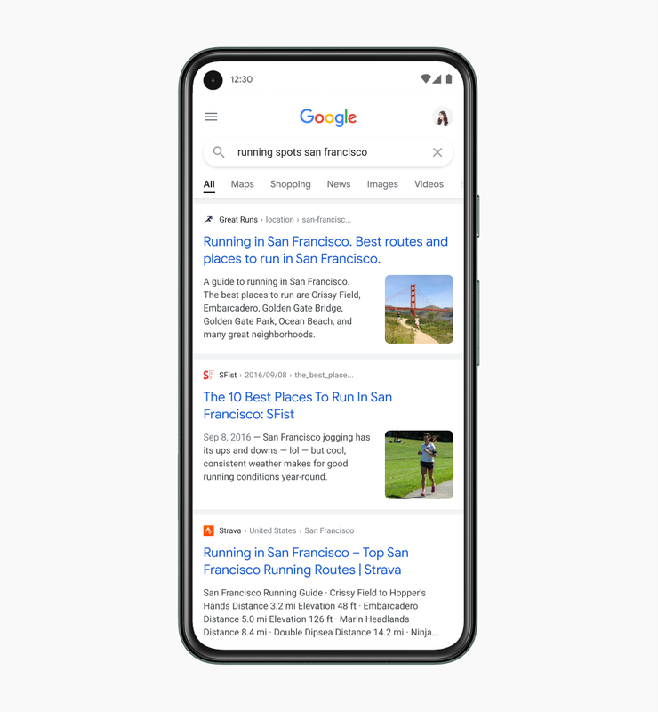
For knowledge panels, for example, it is blatant the greater use of white (instead of the previous shade of blue) and black fonts (also here, instead of blue), with larger characters and spacing that facilitate reading.

More subtle are the differences for snippets: the font of the titles is more rounded and more readable, as well as the text of the description benefits from the more intense use of white and spacing.